Custom chart types allow users to create custom chart displays by writing chart rendering code. Related data is still configured through data configuration, and after the system obtains the data, it is passed into the custom code function, where the chart is displayed based on the obtained data.

Creating Custom Chart Logic

Create a chart component, select the chart type as Custom Chart, click the code edit button to open the custom chart logic code editor, and write custom ECharts chart calculation logic in the code editor.
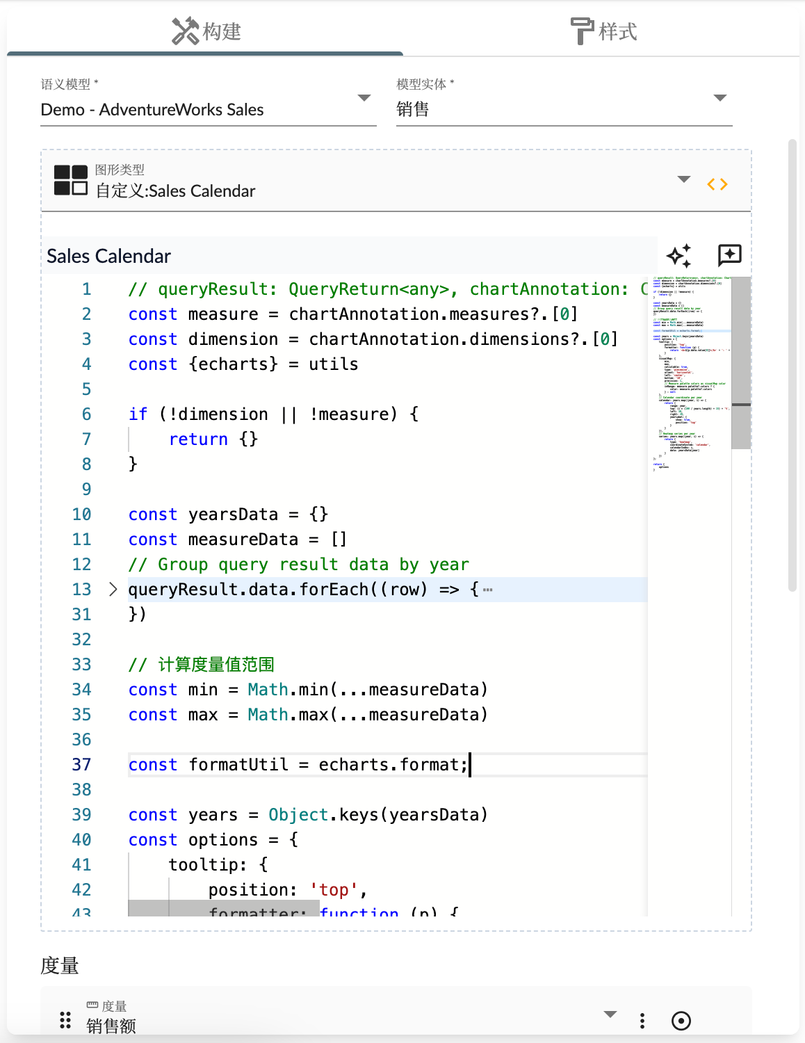
 Custom Chart Logic

Custom Chart Name

The custom chart name is the name of the chart component, used for display in story dashboards, and is also the unique identifier for the chart type.

Custom Chart Function

The logic code of custom charts will be executed as a calculation function by the chart component. The function’s parameters and return result types are as follows:
  • queryResult type is
    {
      status: 'OK',
      data: any[],
      schema: {
        rows?: {
          name: string,
          label?: string
          dataType: string
        }[],
        columns: {
          name: string,
          label?: string
          dataType: string
        }[]
      }
    }
    
    representing data results;
  • chartAnnotation chart configuration information
  • entityType multidimensional dataset type
  • locale current locale
  • chartsInstance ECharts chart instance
  • utils utility function set
Custom logic needs to return results containing:
  • options: ECharts chart Option configuration object
  • onClick: Response function for chart click events, returns events and related slicers
const { getEntityHierarchy, getPropertyCaption } = utils;

return {
  options: {
    // ECharts 图形配置
  },
  /**
   * 响应点击事件,返回事件和相关切片器
   * 
   * @Optional
   * @param {object} event ECharts 事件
   */
  onClick: (event) => {
    // 
    return {
      ...event,
      event: event.event.event,
      slicers: [
        {
          dimension: chartAnnotation.dimensions[0],
          members: [
            {
              value: event.data[getEntityHierarchy(chartAnnotation.dimensions[0]).name],
              caption: event.data[getPropertyCaption(getEntityHierarchy(chartAnnotation.dimensions[0]))]
            }
          ]
        }
      ]
    }
  }
}
Below is an example. The following logic can display data as a 3D scatter chart:
const xName = entityType.properties[chartAnnotation.measures[0].measure].label
const yName = entityType.properties[chartAnnotation.measures[1].measure].label
const zName = entityType.properties[chartAnnotation.measures[2].measure].label

var symbolSize = 10;
var options = {
    grid3D: {},
    xAxis3D: {
        name: xName
    },
    yAxis3D: {
        name: yName
    },
    zAxis3D: {
        name: zName
    },
    dataset: {
        dimensions: [
            chartAnnotation.dimensions[0].dimension,
            ...chartAnnotation.measures.map(item => item.measure)
        ],
        source: queryResult.data
    },
    series: [
        {
            type: 'scatter3D',
            symbolSize: symbolSize,
            encode: {
                x: chartAnnotation.measures[0].measure,
                y: chartAnnotation.measures[1].measure,
                z: chartAnnotation.measures[2].measure,
                tooltip: [0, 1, 2, 3]
            }
        }
    ]
};

return {
  options
}
In the analysis chart property settings interface, you need to configure one Dimension and three Measure fields. Middle

Custom Chart Event Response

Custom chart logic receives the ECharts chart instance, so you can respond to various chart events through ECharts’ event mechanism. Below is an example of responding to the updateAxisPointer event:
// 移除已有事件回掉函数,防止重复处理(因为自定义逻辑由于数据变化会重复执行)
chartsInstance?.off('updateAxisPointer')
chartsInstance?.on('updateAxisPointer', function (event) {
  const xAxisInfo = event.axesInfo[0];
  if (xAxisInfo) {
    const dimension = xAxisInfo.value + 1;
    chartsInstance.setOption({
      series: {
        id: 'pie',
        label: {
          formatter: '{b}: {@[' + dimension + ']} ({d}%)'
        },
        encode: {
          value: dimension,
          tooltip: dimension
        }
      }
    });
  }
});

Appendix

utils utility function set
Function NameDescription
echartsECharts utility set
getEntityHierarchyGet entity hierarchy structure
getEntityPropertyGet entity properties
getPropertyCaptionGet property display name
getDefaultHierarchyGet dimension’s default hierarchy structure
stringifyPropertyStringify field identifier

示例

Related code is:
let progress = queryResult.data[0][chartAnnotation.measures[1].measure] / queryResult.data[0][chartAnnotation.measures[0].measure] * 100
return {
  options: {
    textStyle: {
        fontStyle: 'italic'
    },
    series: [
      {
        type: 'gauge',
        center: ['50%', '60%'],
        startAngle: 180,
        endAngle: 0,
        min: 0,
        max: 100,
        splitNumber: 10,
        radius : '98%',
        itemStyle: {
          shadowColor: 'rgba(0,138,255,0.45)',
          shadowBlur: 10,
          shadowOffsetX: 2,
          shadowOffsetY: 2
        },
        progress: {
          show: true,
          roundCap: true,
          width: 18
        },
        pointer: {
          icon: 'path://M2090.36389,615.30999 L2090.36389,615.30999 C2091.48372,615.30999 2092.40383,616.194028 2092.44859,617.312956 L2096.90698,728.755929 C2097.05155,732.369577 2094.2393,735.416212 2090.62566,735.56078 C2090.53845,735.564269 2090.45117,735.566014 2090.36389,735.566014 L2090.36389,735.566014 C2086.74736,735.566014 2083.81557,732.63423 2083.81557,729.017692 C2083.81557,728.930412 2083.81732,728.84314 2083.82081,728.755929 L2088.2792,617.312956 C2088.32396,616.194028 2089.24407,615.30999 2090.36389,615.30999 Z',
          length: '75%',
          width: 16,
          offsetCenter: [0, '5%']
        },
        axisLine: {
          roundCap: true,
          lineStyle: {
            width: 18
          }
        },
        axisTick: {
          splitNumber: 2,
          lineStyle: {
            width: 2,
            color: '#999'
          }
        },
        splitLine: {
          length: 6,
          lineStyle: {
            width: 3,
            color: '#999'
          }
        },
        axisLabel: {
          distance: 20,
          color: '#999',
          fontSize: 20
        },
        title: {
          show: false
        },
        detail: {
          backgroundColor: '#fff',
          borderColor: '#999',
          borderWidth: 2,
          width: '90%',
          lineHeight: 40,
          height: 40,
          borderRadius: 8,
          offsetCenter: [0, '35%'],
          valueAnimation: true,
          formatter: function (value) {
            return '{value|' + value.toFixed(1) + '}{unit|%}';
          },
          rich: {
            value: {
              fontSize: 50,
              fontWeight: 'bolder',
              color: '#ffab00'
            },
            unit: {
              fontSize: 20,
              color: '#999',
              padding: [0, 0, -10, 10]
            }
          }
        },
        data: [
          {
            value: progress
          }
        ]
      }
    ]
  }
}